Reports, articles, and publication design
You’ve worked for weeks, months, maybe even years on this magnum opus, and you’re ready to disseminate.
Of course a great publication requires legit content, but it also needs legit design. The north star for a successful publication is one that is designed in a way that looks good, reads well, and quickly identifies crucial information. Think not only as a presenter, but as a reader.
When a report or article is published, you want it conveying the most important information in a shortest amount of time.
Colors, fonts, interactive elements, content divisions, infographics, engaging design, navigation — it’s now all part of the publication and report design mix.
Here are a few strategies we use to deliver visually engaging, interactive, and informative publications.
We define the layout and flow
We want a clear design for your publication. We avoid jamming too much information into a page that makes it impossible or rather frustrating to read and understand at a glance. We want to educate, draw attention, influence decision-making, and highlight crucial insights.
No matter who they are, they want to know the bottom line quickly. A good starting point is identifying the most crucial pieces of information. We start with figures or a headline, and then work our way down into the text, adding visual elements to further make it more actionable. This is basic content hierarchy, which makes for appealing publications.
We avoid too much text in one view
Folks like to pass time reading books, but when you’re trying to move quickly through your day whilst learning, data and information needs to be quick and easy. One doesn’t want to be slowed down by pages and pages of plain text. You want information with the most precision, in the least amount of time.
We break up text into paragraphs with white space, imagery such as maps, infographics, icons, photos, and other professional design elements. By introducing graphics and a good amount of clean white space we make the content of publications incredibly easy to understand.
Here’s an example.
We size and position to show hierarchy
We highlight one or two specific sections on a page, and use size and position to show hierarchy. This makes sure we direct the reader's attention is naturally.
We organize the content in reports in a way that reflects the nature and importance of the information being showcased. That means we decide what information should take priority ahead of time. Then we arrange the content in a logical, contextual order so that it reads well.
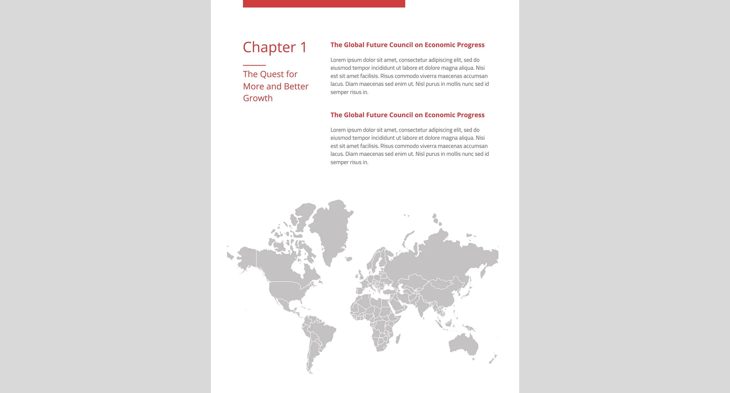
Take a look at this report page as an example.

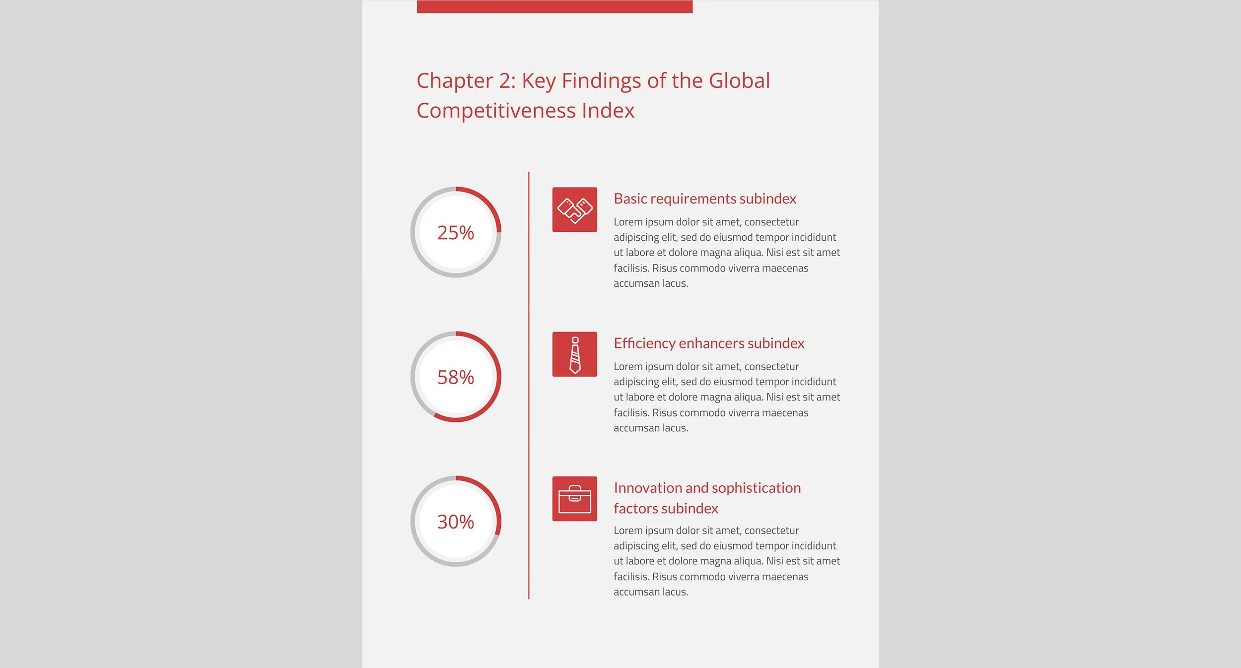
We use callouts to highlight important information
No matter if it’s a scientific discovery, marketing analysis, or annual report, we want to present the most critically relevant information in a quick and dynamic form. This helps draw valuable conclusions faster.
Callouts emphasize a particular facet by pulling it out of the text and putting it in some sort of aesthetic form.
Although we do use various tables, icons, fonts, and font colors to call out pivotal information, we recommend keeping callouts somewhat minimalistic. We don’t want too much noise.
This example is an attendance breakdown by gender and industry.


Looking to create a stand-out publication?
We maintain style continuity
Continuity is one of the key principles of Design DNA. When elements have a consistent look, the function and learnability of the publication improves significantly. We don’t want one graphic looking like it came from ‘95 Office Paint, and another looking like it came from the future. Photos, icons, and all elements should look like they belong together.
Before we even get started, we define the typography, colors, grid, space, size and positions we’ll use in the project. A strong visual hierarchy and continuity, delivers a professional experience that's easy on the eyes, and even easier on the brain.
Also, we want to incorporate the entities’ branding into publications. Using (or creating) brand standards such as a logo, colors, and fonts from the get-go makes these publications much better.

We simplify complex data with visualizations
Brains LOVE to solve puzzles and understand things. Visual elements are much more “sticky” to brains, more so than words. If there’s complex information in the text, we try to use data visualization to make it more easily understood.
Let’s say there’s a deep financial review of some company. It’s got a plethora of complex data such as expenses, budgets, MRR, ARR, CAC, etc. This can be volumes of text and numbers and be pretty painful to see, let alone read. We distill this into visuals so the reader gets what they need right away. Elements such as charts, graphs, pictographs, and figures add a component to your report that text cannot: speed.

We use UX design and interactive elements
If a publication can live online such as a web page or even better its own website, UXD (User Experience Design) can make use of interactive elements which are powerful components that make a big difference in the experience with your publication.
Unless it's getting professionally printed, a 100 page report can, and probably should, be turned into a website. Using separate pages, navigation links, animations, and more, will make navigation and reading much easier than linearly reading through a PDF document.
Whitespace
It’s better to have more pages in a publication with lots of nice whitespace, rather than less pages that are all crammed with content. Whitespace is a key design tool to harmonize text and elements, and better organize content to improve the structure, flow, and overall experience.
Whitespace doesn’t necessarily mean white background. A solid background color totally works too. We just want to leave open real estate that doesn’t require attention. This allows for more attention to the elements that are there.
This design has a gray solid background. It contrasts nicely with the red. Along with a few elements and a good amount of space, the readability is significantly improved.
Ready to talk about your publication and what we can do to ensure your readers are reading and understanding it?